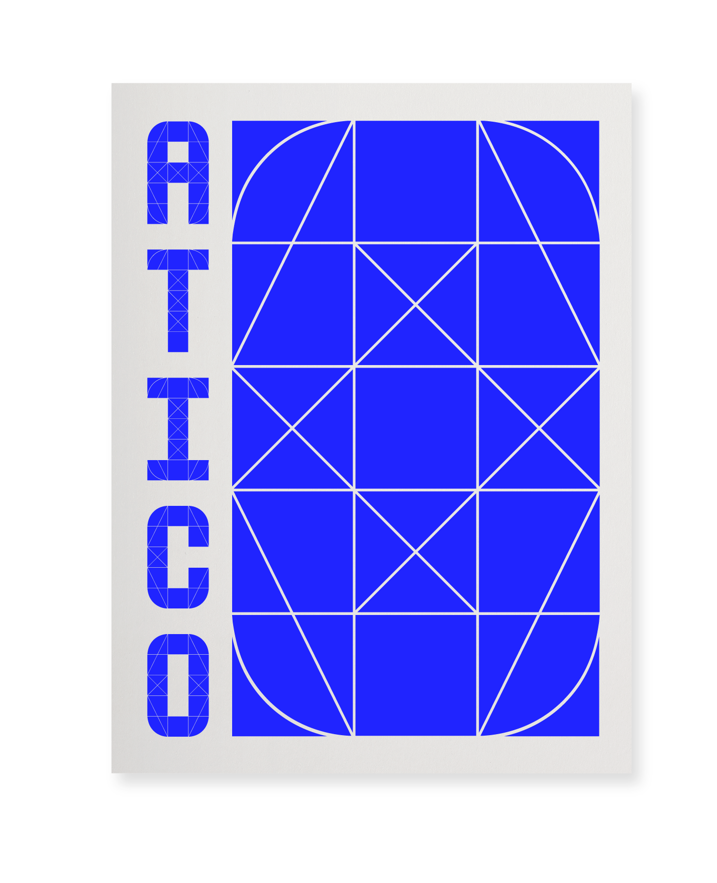
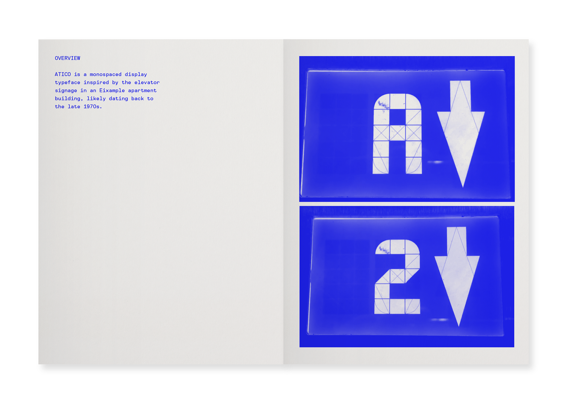
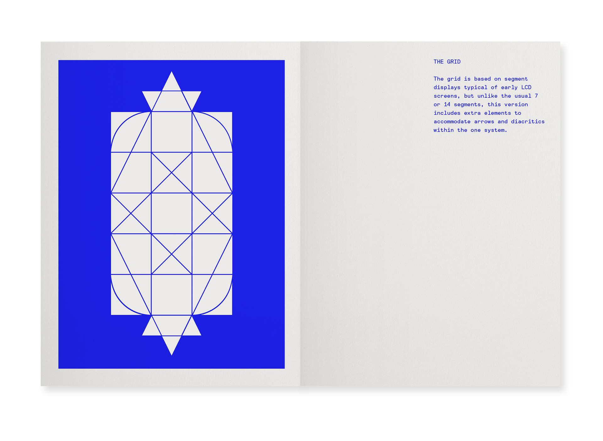
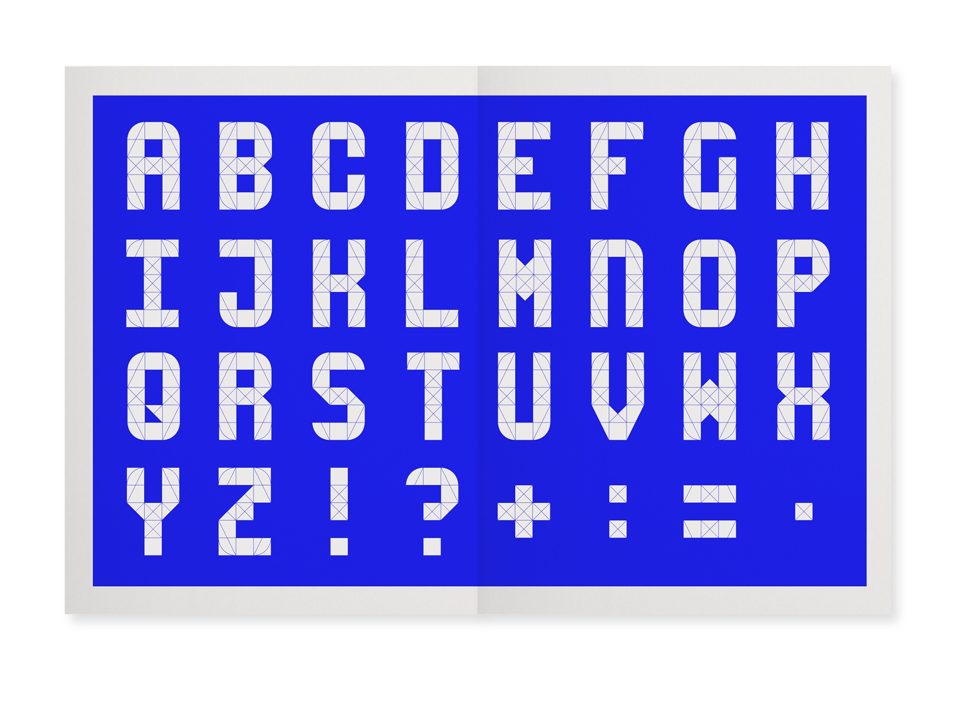
An experimental display typeface, ATICO is based on signage found in the elevator of an apartment building in the Eixample district of Barcelona. The original was likely from the 1980s and a form of the segment displays that were used in early LCD screens.
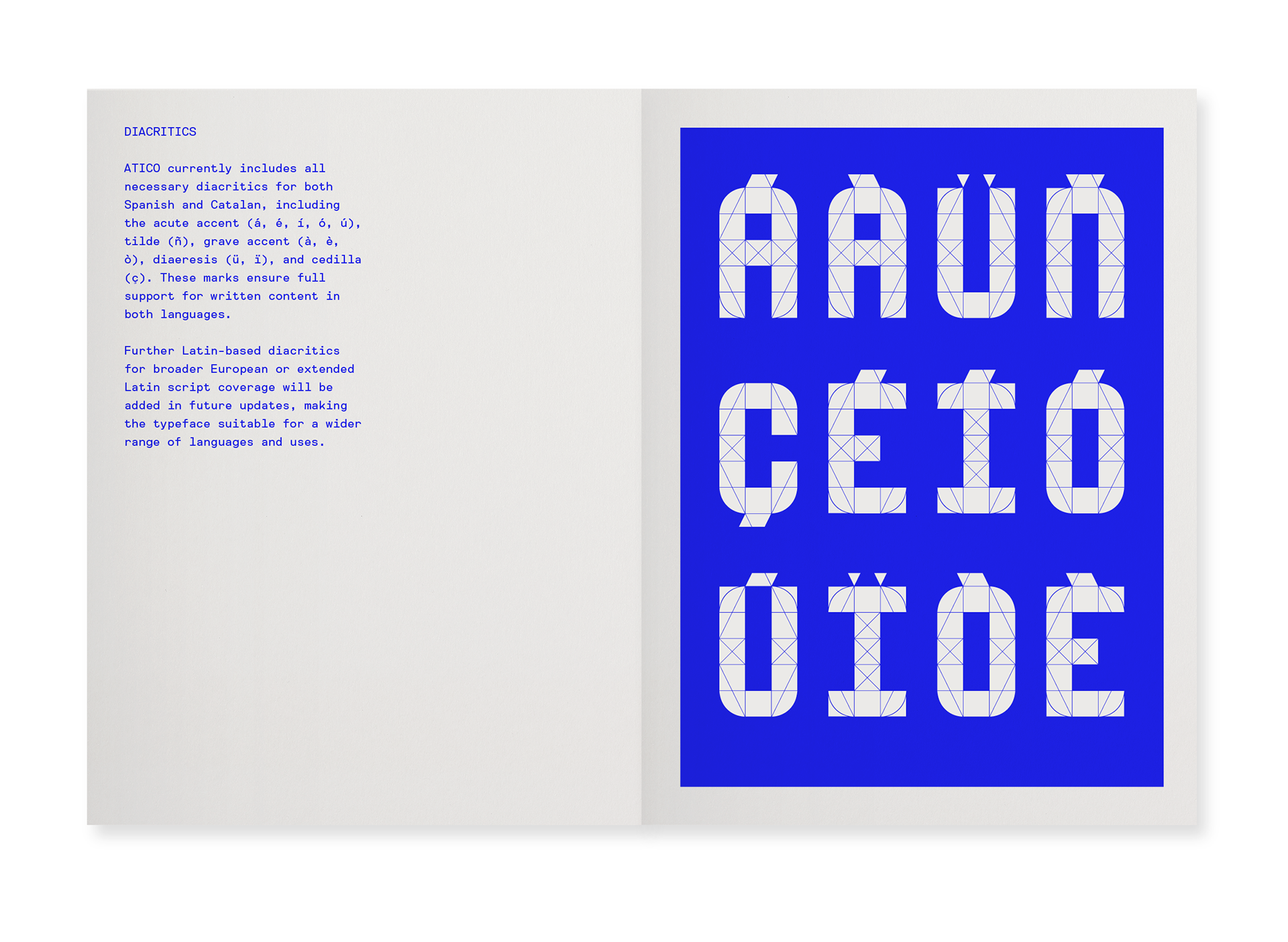
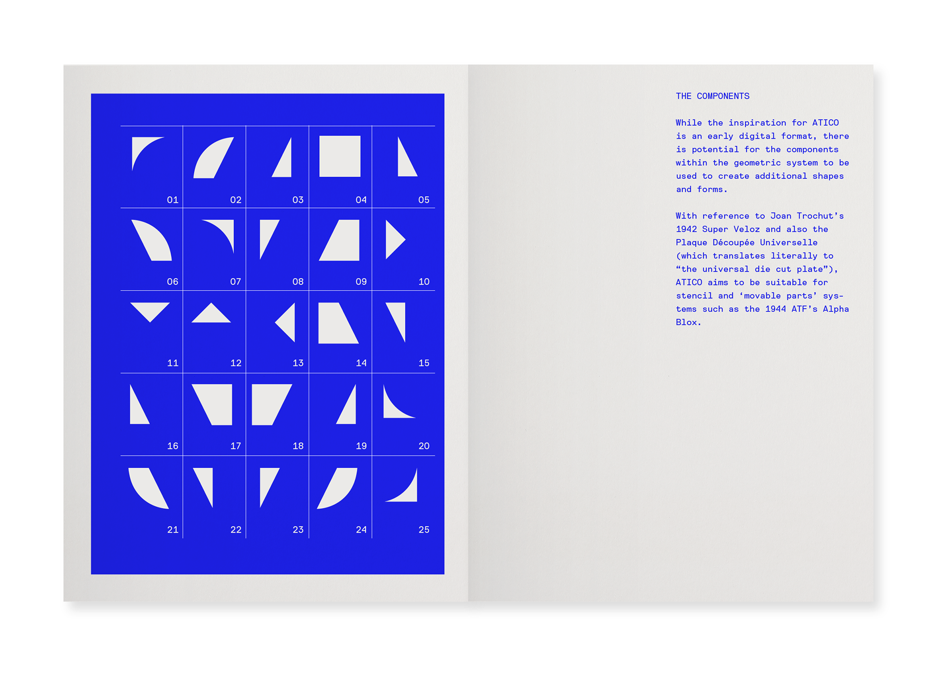
Usually 7 or 14 segments were used but this example had more to allow for the inclusion of arrows and a fuller alphanumeric set. The development for ATICO removed any unused components and added instead some additional forms for the creation of diacritics. It was also decided to include the segments needed for arrows within the one panel as the original worked across two.
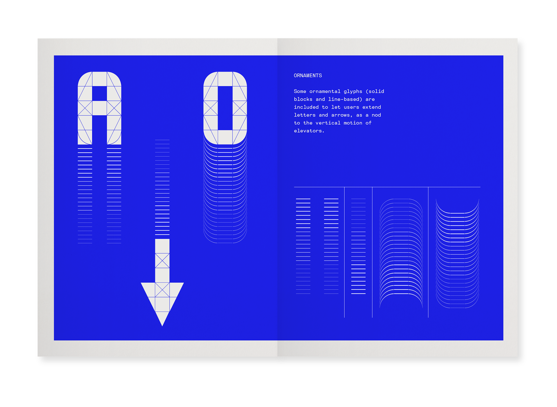
Some ornamental glyphs (solid blocks and line-based) are included to let users extend letters and arrows, as a nod to the vertical motion of elevators.
The first iteration of ATICO was created during the pandemic and has been restarted as part of the MCRBCN exhibition during La Mercé festival 2025.............
Images: Sketches for a typeface specimen showing the elements developed to date.